|

By Jim Beard
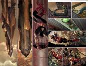
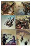
Imagine a new Marvel book written by Rick Remender and illustrated by John Romita Jr. and Klaus Janson. Imagine it features one of Marvel’s greatest superstar characters. Imagine its coming soon.
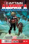
Imagine no more: the title’s CAPTAIN AMERICA, its part of the new Marvel NOW! initiative and its first issue drops on November 21.
We checked in with the book’s artistic team before the series debuted.
Marvel.com: John, isn’t this the first Captain America series that you’ve done?
John Romita Jr: Yes, I haven’t done a Cap book monthly until now, that’s correct.
Marvel.com: How does that feel? When it was brought to you, why did you take this plunge?
John Romita Jr: It was suggested to me by the suits. [Marvel Chief Creative Officer] Joe Quesada, and those guys; that’s what I call them, the suits. It’s a term of endearment. [Laughs]. They came to me with the idea. I think I whined and moaned for a few months about having done too many years on group books [like] AVENGERS, and then I did AVENGERS VS X-MEN. And I was fried, but not literally. And I said, “guys, I’ll take Spider-Man,” and they said, “it’s kind of taken up right now, so how about Cap?”
I’m very happy to do Cap, but part of this, part of the attraction, and I don’t know if it’s good or bad, is that I hadn’t done the title before, and I’m trying to get to every [Marvel] title before I decide to go off into the sunset. So there was the attraction. I think I only have to do Fantastic Four, maybe Doctor Strange. I would love to try Doc Strange and Fantastic Four some time down the road.
My father did Captain America when he was very very young, [and] he’s always been a part of that lore. My father did it back in the 50’s, and even though I’m really attached to [his] Spider-Man, seeing Captain America by my father so early on was always something I enjoyed.
Marvel.com: What will it be like for you working with Rick Remender? What’s Rick doing that excites you?
John Romita Jr: He’s different, that’s for sure. If we could go by this storyline, even if he just stepped off a train from Boise, Idaho, this is completely different, this storyline. That’s one thing. But he is an artist. He has been an artist, so he has a feeling for visuals. And that’s good and bad. Good because he’s got a feel for visuals, and bad because as an artist, he feels like, well I can throw anything at this chump, and he’ll come up with the answer for it because he’s an artist. “I’m an artist, so we know how to do it.” I exaggerate to clarify.
He’s got an amazing storyline going and if this were 20 years down the road and this were considered his best, then you’d say he’s the best in the business. It’s a hell of a storyline. He’s got a grasp on it, and maybe he was from another world because this is really other worldly. [Laughs]
Marvel.com: There’s going to be some tweaking of the Captain America uniform. Or do you want to call this a full redesign?
John Romita Jr: I don’t think it’s a full redesign. You still know it’s Cap, you can see things in it that are Captain America. But there’s a difference, absolutely. I think the spandex and the spandex shorts have gone the way of the dodo only because they were overused and so on. This is a little more realistic. You’ll see seams on pants, you’ll see shoelaces on boots etc. And I enjoy that.
Marvel.com: Do you feel that the recent movie influenced how you approached this?
John Romita Jr: I wouldn’t say that’s a lie, I would say that there’s a little bit of influence. But again, the movie is based on the original character, so we’re basically going around in circles. You can’t deny the stars and stripes and chain mail, so to speak.
Marvel.com: What about brand new characters? Any one or two in particular that you’ve really gotten into the design of and you’re proud of?
John Romita Jr: There are a couple of characters that are unnamed. Well, there’s one that’s named. If you watch the Phrox, these outer worldly creatures, I designed them visually. They’re interesting. The minions of Arnim Zola are interesting also. And Rick wanted to use a reference from Jack Kirby’s version of the characters, and that’s good and bad. Great because I love Kirby’s stuff, but bad because I didn’t just want to completely base it on Kirby’s stuff, so I went a little bit in a different direction.
Arnim Zola’s minions are not the aberrations that they were from Jack Kirby’s days. I went a little bit more demonic, so to speak. And then the other outer worldly characters have to be different. Everything looks different and we have species, but yet each species has eyes, nose, ears. They walk, they crawl, and they have legs. So I tried to do that with these two sets of species.
You have Arnim Zola’s strange characters and you have these Phrox and I tried to give them at least one tiny bit of commonality, so there’s a little bit of an armor look, and a little bit of a lizard-demonic look to them that might be a little bit of commonality. At least in my mind, they’re from completely different planets, and yet they’re on the same planet. That’s probably too much thinking, but I can’t help myself. I’m always trying, and I don’t always succeed, but I’m always trying to do something different than I have done in the past. And if it doesn’t work out that way, it’s not from lack of trying.
Marvel.com: One of the book’s characters is going to be this young boy, the son of Zola. Is there an approach to drawing children that you take, something that absolutely needs to be there?
John Romita Jr: It’s difficult. It’s like drawing animals or cars, it’s always a challenge. You have to make sure that the ears, the nose, the eyes and the mouth are proportioned to the size of the head, and the head has got to be larger. And nobody’s perfect, nobody gets it right every single time, so if it looks different with a child, if they look different from the previous panel or previous page it really is glaring compared to the characters that have costumes. If you have a bad day, Captain America’s star might not be straight or his shield might not be as ovular or circular, you still get by, he still has a shield. But if a child doesn’t look the same panel to panel, it’s glaring, so you have to be careful.
He’s 10 years old, and I have photographs of my son at 10 so I kind of looked at the proportions, and interestingly and ironically, I’m working on HIT-GIRL on the side, and she’s supposed to be 12, 11 or 12. I’m trying to distinguish between a 12-year-old girl, and a 10-year-old boy. One is an aberration, or an alien so to speak, and one is the average 12-year-old.
You can’t get references on fashion for a 12-year-old very easily [when you’re in your] fifties, man. I had to send my wife out and she’s come back into the car and I say, “oh I need something better.” Fortunately, Zola’s son doesn’t have any fashion sense.
Marvel.com: You’re going to be working with Klaus Janson, who I understand is giving you a chance here. He’s says he’s going to introduce you to the world as a new artist.
John Romita Jr: Klaus and I know each other too long. I personally think he’s the best artist, as an inker, and I think he’s the best inker in the business. That’s not to take away with the guys that I’ve worked with in the past. I know what Klaus can do as an artist, and this is just his day job; who knows what he’d do if he weren’t an inker. But, he’s a brilliant artist; he can do storytelling as well, he’s done his fair share of penciling and drawing. I think he’s brilliant and I rely on him, just like I rely on Tom Palmer, who is equally as talented. Tom does my breakdowns. The breakdowns on KICK-ASS and HIT-GIRL aren’t quite as difficult as the standard breakdowns because the series looks like it’s two tone blacks and shades. But Tom and Klaus are from the same generation and I know them, and I’ve worked with them for many many years.
On mainstream books, Klaus is just brilliant. And Tom is the same talent level, only in a different vein and a little bit different look. I am the luckiest penciller on the face of the Earth right now. On top of that, I get to work with Dean White, who is equally as talented as an artist, only he’s a color artist, he’s a painter. I can’t go wrong here. I’m very, very lucky. I will never, ever take sole credit on this, because Klaus and Dean, and then Tom and Dean, do, for lack of a better term, make me look good.
Marvel.com: Klaus, let’s toss it over to you, then: in your opinion, what are John's strengths as an artist, and what do you feel are your own strengths that make you two the solid art team that you’ve become?
Klaus Janson: John is one of the rare artists in this business that can both draw and story-tell second to no one. A lot of artists fall into one category or the other and only a handful can do both really well, and John succeeds on that rare level. So whenever I get a chance to work with someone of that caliber, and a character that is so well known, I would be foolish to pass that up.
I'm happy to hear that you think we make a good team. I try to emphasize the power and strength that John has in his pencils and maybe add a tiny bit of detail to some of the backgrounds in the way of texture but any time I ink a page penciled by John, I just think that I am a very lucky inker!
Marvel.com: What was it about CAPTAIN AMERICA that engaged you and made you want to join the book?
Klaus Janson: Captain America is as historically rich and iconic a character as Spider-Man. The first time I was aware of Cap was after reading AVENGERS #4 when they defrosted him out of the block of ice way back in the day and have been following him ever since. I was just completely taken in by his costume and his story. He always seemed a little magical to me. So when Marvel asked me to ink the character it was pretty much a no-brainer for me. And of course working with John is always a pleasure. This is a guy who could draw the phone book and make me what to ink it.
Marvel.com: What do you see in the character of Captain America himself? And how do you feel about his new look?
Klaus Janson: I was always interested in the man-out-of-time angle, for one. He's also one of the few characters in comics who has a very simple approach to life: he does what's right. He's not an anti-hero and is very much a boy scout. The purity of what motivates him seems so clean and simple. The way the Avengers movie handled the character was just about perfect.
I think the new look, which in some ways is almost the "old-look," is great, but with one exception: too many scales to ink!
Marvel.com: Will there be a tone or feel that you'll try to bring to CAPTAIN AMERICA in your embellishing that’s perhaps different than some of your other work?
Klaus Janson: I always try to gear my approach to the specifics of the story so, as we go along, I will adjust according to the script. Without giving too much away, I get to work with John in an unusual environment with an unusual population so I try my best to make those things look different than what a Daredevil environment, for instance, would be.
Part of being a good artist is being able to improvise and adjust to whatever the story calls for and I like to think that I'm pretty fast on my feet in that way. And, of course, if I could ink with my feet I'd be twice as fast.
|

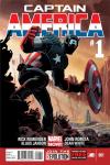
 #3 cover by John Romita Jr., Klaus Janson & Dean White")