|

By Jim Beard
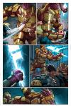
In coloring the books that you know and love, prolific artist Dean White has become part of the backbone of the Marvel Universe. Fitting then that one of his current assignments possesses plenty of backbone of its own: CAPTAIN AMERICA.
Together with the title’s writer, Rick Remender, and the other spokes of its artistic wheel—John Romita Jr. and Klaus Janson—White uses his hues and tones make the alien environments of Dimension Z and the rough streets of the 1930’s in the book come alive.
We approached White to ask him about his own outlook on the character of Steve Rogers and how he brings a bit of color to the Captain’s world.
Marvel.com: Dean, what was your initial reaction in taking on the CAPTAIN AMERICA coloring job? What does the character of Captain America mean to you?
Dean White: I was really excited about the story. I tend to respond to both the story and art. Rick Remender shared with me the story arc for the first 10 issues as well as the overall arc for the next two years and it was daring and fun and had a lot of heart. I also cannot do what I do without great art to build from, and John is a damn fine class act and a great storyteller. He just excels at the subtle things like how a person looks around the door and raises his eyebrows to sell a line or a scene. Throw in Klaus Janson, who is a master at what he does, and you just can’t go wrong. It’s really great to see him penciling on DAREDEVIL: END OF DAYS; just beautiful stuff.
It is hard not to go on and on about those two artists. They are great pros and also real gents to boot. Both have been just great to work with and super supportive of me over the years. So as humbly as I can, thanks, guys, you the best!
As for Cap the character, to me he is a man who could be thought of somewhat squarish but has paid the price and made the hard decisions. He leads by example and not bluster, and honestly we could use more of that in this world.
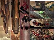
Marvel.com: What would you say is your overall coloring blueprint for the series? How are you approaching the Dimension Z scenes as opposed to the 1930’s scenes in terms of mood and lighting?
Dean White: Overall, I wanted to give it as much energy as I could and make it jump out. Often colorists, including myself, will distinguish flashback scenes from current scenes by using a singular or monochromatic color scheme. I decided to do something different for this book. In the 1930’s scenes I’m using watercolors. It’s fun for me to switch things up sometimes, plus by using a more traditional form of coloring it seems to reinforce the feeling that these scenes are happening in the past. The action that occurs in the present needed to have an alien vibe, but I still needed to control the colors so that you don’t start noticing them over the scene. So I went with the idea that Dimension Z would be lit with a rust-colored sun.
Marvel.com: It sounds like you’re enjoying yourself. What's a typical day like for you working on the book?
Dean White: Well, most of the time I work with Photoshop and a big Cintiq, a screen you can actually draw on that has pressure and angle sensitivity so that the harder you push and the angle of the stylus actually makes more “paint” come out. Once in awhile, though, like for the flashback scenes for CAPTAIN AMERICA, I will print out the line drawings and then watercolor the page. I scan it back into the computer and make some final adjustments with Photoshop.
I normally think of the panels on a page as beats in music and I try to keep an eye on where the focus panel is and how to play up to it and out of it. So, when I’m working on a page by myself, I initially lay out all the panels on a page in separate flat colors. It helps me to focus on how the color for that panel or scene works throughout the page. Then I break up the action in each panel into big shapes and just make sure these shapes work and go along with how I want the panel to feel. If it’s intense I play up the paint strokes and colors so that they seem very active or I’ll play it down with softer strokes and maybe muted colors if it’s a quiet moment.
It’s different when I’m collaborating with another colorist. After issue #1, Lee Loughridge came on to work with us. He’s really great at what he does and by him doing the initial pass on the pages it saves me a lot of time so that I can continue to work on this book. Thanks, Lee, for doing the heavy lifting! Lee and I talk about the pages and where they should be going. Together we discuss what stands out to us and then either I will do my white lines to it first and send it off to him so that he can do the first pass of coloring and rendering or he will jump right in and kick butt. Then it comes back to me and I go over the whole page. I paint in the finish and adjust and tweak the pages. It’s a lot of fun to see what Lee comes up with and I’m grateful that he has come in to work with us.
Marvel.com: One of the things people first notice is that your look on the book has a very painterly feel; why and how do you believe this suits it and its characters?
Dean White: I always try to respond to the story and the art and also take into consideration what the artist and writer want from me. Usually when I get brought in the artist has requested me and really wants me to be a part of the art by taking what I’m given and adding to it as best as I can. Tom Palmer and I usually describe it as each person takes what they are given and adds to it, so that by doing this hopefully at every stage it gets better and closer to a finished piece of art. I have a painting and illustration background so it’s hard for me not to approach the art work this way. The other artists and writers always see every page before they go to print and if they feel anything is wrong with the work I’m doing I change it. It is very collaborative and I would never want to do something that the penciler or inker would feel went against what they want.
I am usually hired to be a strong voice and add to the book, but I never want to mess up the storytelling or have the rest of the art team pissed and feel as if I bulldozed over them. It is all about the finished page and how the reader responds to the art and story together.
Marvel.com: Looking at your CAPTAIN AMERICA work today, how do you feel your approach to design and palette has changed since your first coloring project?
Dean White: Oh, it has changed dramatically. When I came in over 17 years ago, it was when people were just starting to use Photoshop and trying to figure out how it works. Everyone coloring then was very similar using similar approaches to colors and rendering styles. Today it is very different and you can see how each colorist has far more of a distinct voice. For me the change happened when I threw out all the stuff I learned on “how to approach comic book coloring” and instead tried to think how I would do the page if I was painting it traditionally but used Photoshop instead of paints. So I just keep going down that path. I try to make it feel as organic as possible and push myself harder and harder to get better.
Marvel.com: Where do you see comic book coloring five years or more from today, not only in technology, but in approach and mind-set?
Dean White: I think coloring as people have thought of it is gone and everyone, including the colorists, is just now changing how they think of it. At the beginning of Marvel, and comics in general, color was an afterthought and just meant to help separate the shapes but otherwise was not that important. Then in the 1970’s artists wherever they could tried to do the color guides themselves. Tom Palmer and Klaus Janson would jump and do them whenever they could since they knew how important it was to the finished reading experience. As technology made things easier to bring in different techniques, people saw it expand to include markers and watercolors in the 1980’s.
Then in the 1990’s computers brought in a completely new approach. You now have huge ranges from flat-styled coloring to fully painted looks, but all are called “coloring.” We as an industry grew with the technology and the colorists pushed themselves to get better so that the coloring of old really isn’t what “coloring” is today, and this has really snuck up on all of us. I really like where comics are going. We see more varied techniques that are really suited for each book and art teams. I think the awareness of how much colorists of today do needs to grow both inside and outside of the companies. Coloring is a process more like art now rather than an afterthought. We all are growing and keep on trying to get better.
Pick up CAPTAIN AMERICA #3 on January 16!
|